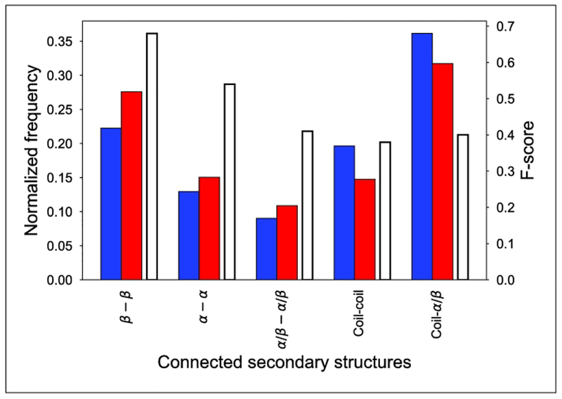
Figure 7.
Success of contact prediction as a function of connected secondary structures. The x-axis shows the types of secondary structures connected. The left y-axis shows the normalized frequency of contacts: the blue columns represent contacts observed in structures, while red columns refer to the predicted contacts in the same category. The right y-axis shows the accuracy of contact prediction in each category using F-score measure, and the corresponding columns are white with black edges.

