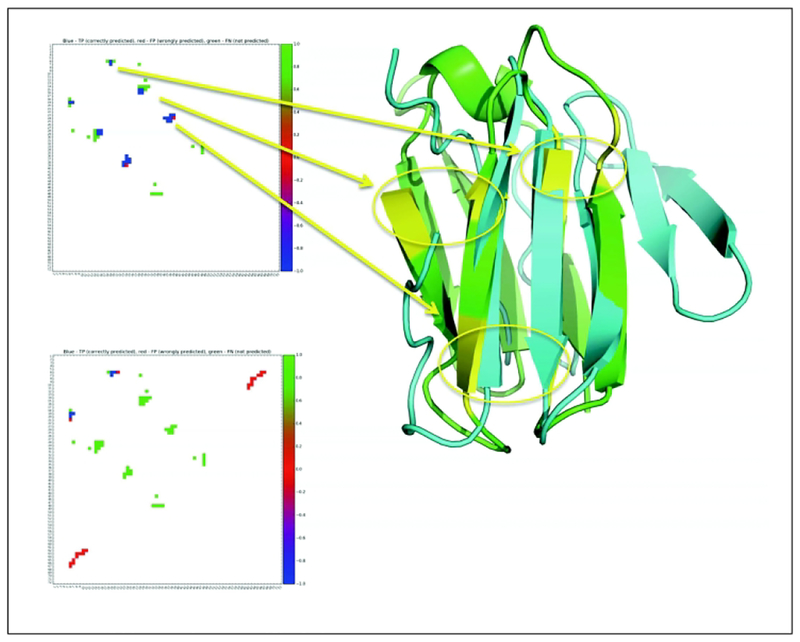
Figure 9.
Contact maps are shown for the same target (T0953s1d1), upper and lower maps refer to a highly accurate (F-score 0.64) and inaccurate (F-score=0.15) predictions. Green, blue and red colors in contact maps refer to correct, missed and incorrect contact predictions. The hubs of interactions are visualized on the ribbon models with yellow circles marking the networks of contacting areas. Blue and green ribbon models refer to the model built on the upper contact map (GDT_TS scores of 54.48) and the experimental structure.

