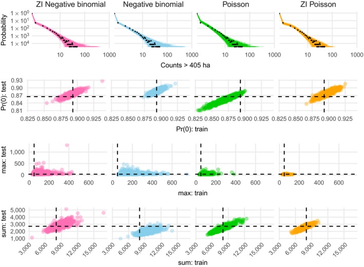
Figure 4.

Count predictive checks. Row one shows observed count frequencies as black points and predicted frequencies as lines. Rows two, three, and four show predicted proportions of zeros, maxima, and sums (respectively) in the training and test data, with empirical values as dashed lines. Rows two through four facilitate comparison of performance on training and test sets. Ideally, model predictions cluster around the dashed lines for both the training (x‐axis direction) and test (y‐axis direction) sets, leading to a tight cluster of points at the intersection of the dashed lines. ZI, zero inflation; max: test is the maximum value in the test data, sum: test is the sum of values in the test data, Pr(0): test is the probability of zero in the test data, while max: train, sum: train, and Pr(0): train represent the same quantities for the training data.
