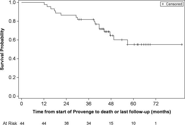
Fig. 2.

Kaplan–Meier plot of overall survival for enrolled patients (in months) (LUGPA cohort):-Y-axis represents the probability of patients alive while the x-axis represents time in months for 44 patients identified at 4 LUGPA sites. On the bottom of the figure are listed the number of patients at risk by time point. The median overall survival for this population has not been reached. Median follow up for this cohort was 96 months
