
FIGURE 2.
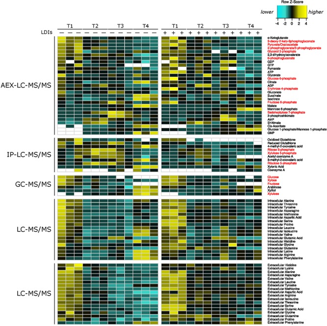
Heatmap of all metabolomics data. Heatmap of relative metabolite concentrations (rows) for each condition (columns) where metabolite concentration is scaled within each row. Yellow denotes higher metabolite levels and turquoise denotes lower metabolite levels, white denotes metabolite concentrations below the range of our standard curves. All concentrations were calculated as μmol/mg of dry cell weight for intracellular metabolites and as μM for extracellular amino acids. Metabolite names in red correspond to pentose phosphate and Entner–Doudoroff glycolysis metabolites. AEX-LC denotes anion exchange liquid chromatography and IP-LC denotes ion pair reversed-phase liquid chromatography.