
Fig. 2.
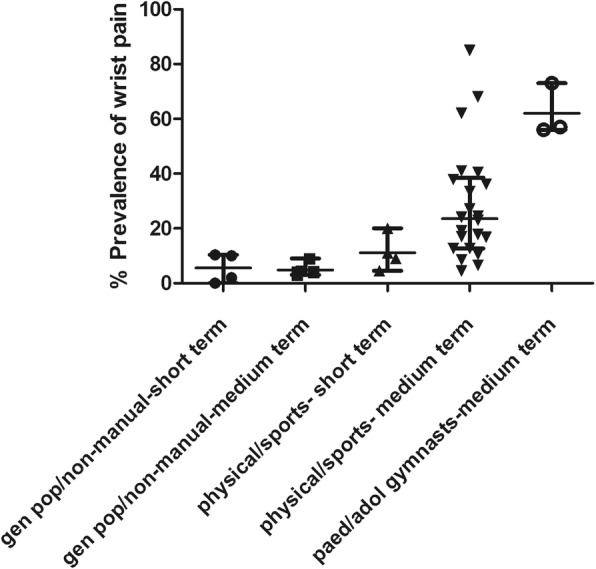
Scatter plot depicting the prevalences of wrist pain in different groups. The line and bars represent the median and interquartile range for each group
Official websites use .gov
A
.gov website belongs to an official
government organization in the United States.
Secure .gov websites use HTTPS
A lock (
) or https:// means you've safely
connected to the .gov website. Share sensitive
information only on official, secure websites.
Scatter plot depicting the prevalences of wrist pain in different groups. The line and bars represent the median and interquartile range for each group