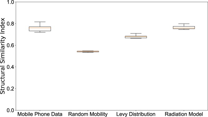
Figure 6.

Spatial analysis. Boxplot of the value of the SSIM Index for each weeks during the 2013–2014 outbreaks using the best parameter - shown in Fig. 3. SSIM index values were calculated for each epidemiological week during the outbreak for each of the 100 simulation runs. The distributions of these values are shown as boxplots for each mobility model in this figure. The boxplots show the minimum, first quartile, median, third quartile and maximum among the SSIM values observed. We see that in all cases, the range of data is quite small; the mobile phone data and radiation model results are clearly distinguished from the random mobility and Levy-distribution results.
