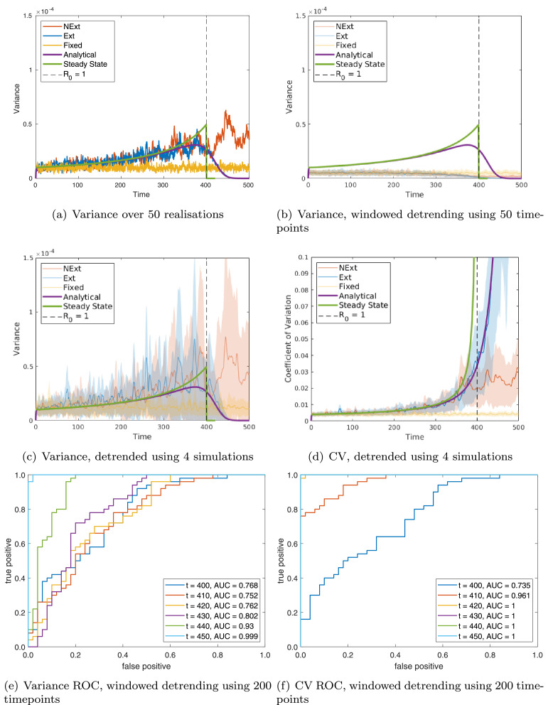
Fig. 2.
Single population: comparing predictions to simulations for variance: (a) over 50 realisations; (b) over a moving window of size 50 timepoints; and (c) over a moving window of size 50 timepoints, first detrending using the mean of 4 simulations and (d) of the CV calculated over a moving window of size 50 timepoints, first detrending using the mean of 4 simulations. ROC curves are calculated over 50 realisations at various timepoints by thresholding in (e) variance; and (f) CV using windowed detrending. For each ROC curve the legend gives the area under the curve (AUC), suggesting how predictive that indicator is (AUC closer to 1 are more predictive). Each figure shows: steady state predictions (green line); dynamic predictions (purple line); simulations of the model going extinct (Ext, blue line); simulations of the model not going extinct (NExt, red line); and simulations of the model with fixed β (FBeta, yellow line). For repeated simulations each line is the mean value obtained over 50 simulations and the shaded area represents one standard deviation about the mean. (For interpretation of the references to colour in this figure legend, the reader is referred to the web version of this article.)

