
Figure 1: Dose-response curves for the 8 scenarios in the simulation study.
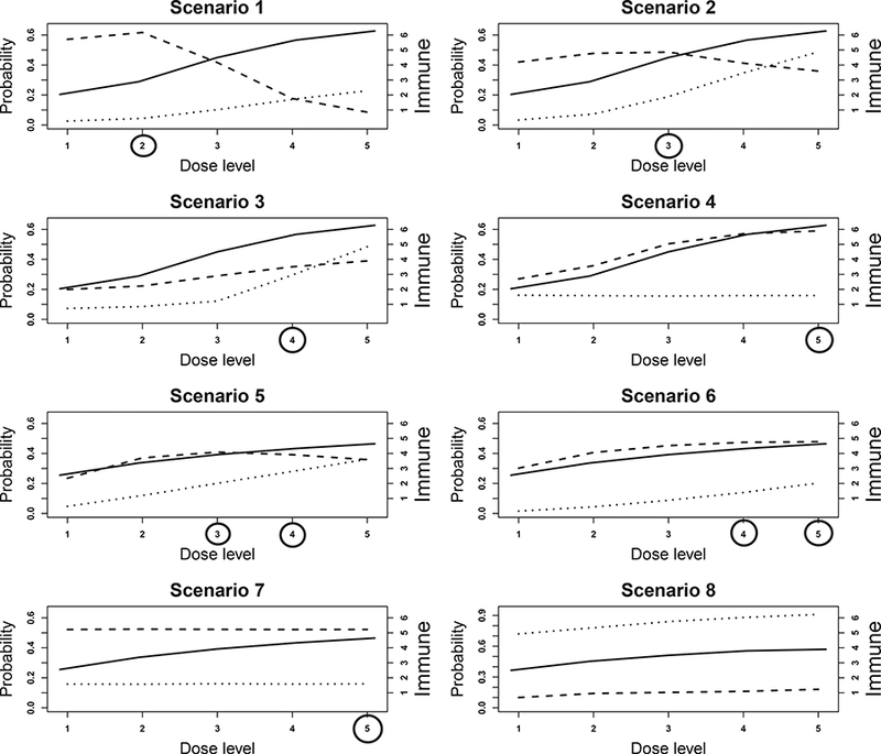
The dotted, dashed, and solid lines are the toxicity (πt), efficacy (πE), and immune response (E(YI)) curves, respectively. Toxicity and efficacy are plotted against the left y-axis, and the immune response is plotted against the right y-axis. Target doses are indicated by circles.