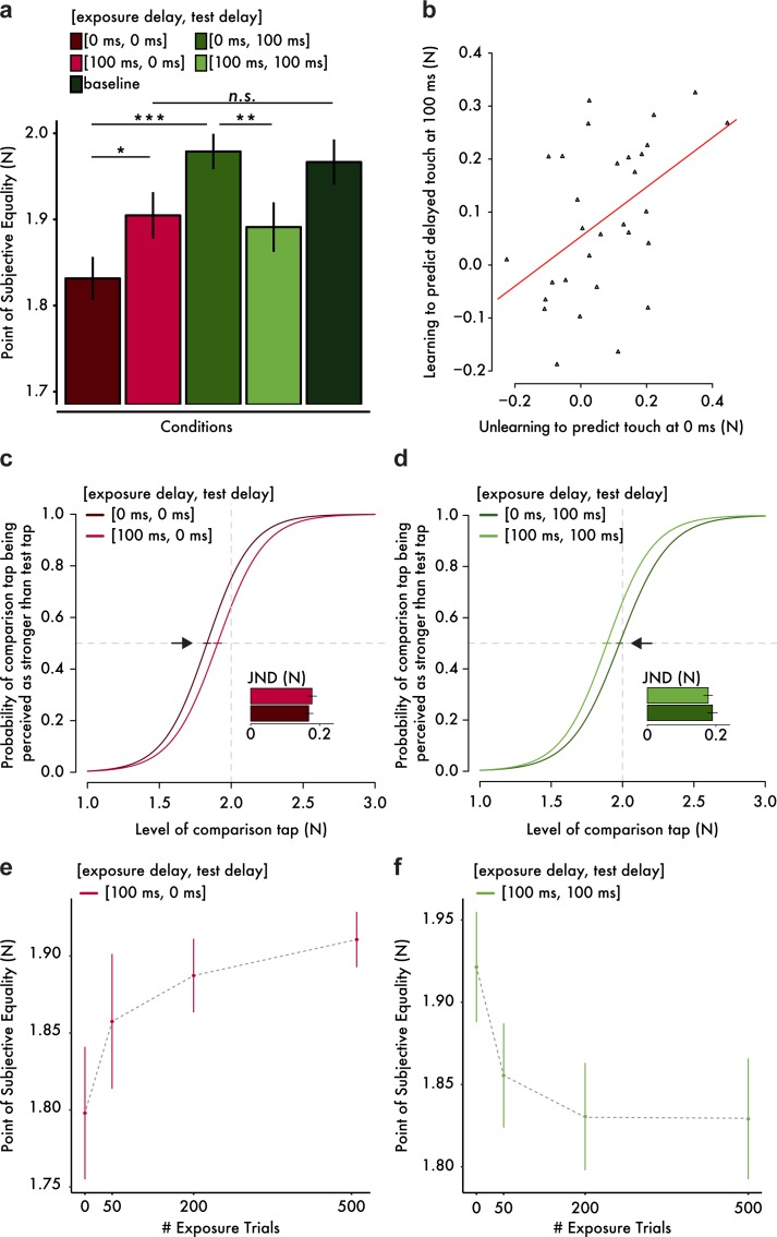
Figure 2. Results from the somatosensory attenuation experiments.
(a) Mean PSE (± s.e.m.) for each condition. Only the important planned comparisons are displayed (*p<0.05, **p<0.01, ***p<0.001, n.s. not significant). (b) Scatterplot of the attenuation shifts in immediate touch (unlearning) and delayed touch (learning). The more participants unlearned to predict the immediate touch, the more they learned to predict the delayed one. The orange line indicates the fitted regression line. (c, d) Group psychometric functions indicating significant attenuation shifts for immediate (c) and delayed touch (d). Error bars indicate the standard error of the mean (s.e.m.) of the PSEs. Subplots indicate the mean JND (± s.e.m.) for each condition. The horizontal gray dashed lines indicate the 50% point of psychometric functions, and the vertical gray dashed lines indicate the true intensity of the test tap (2 N). (e, f) Mean PSE (± s.e.m.) as a function of the number of exposure trials.


