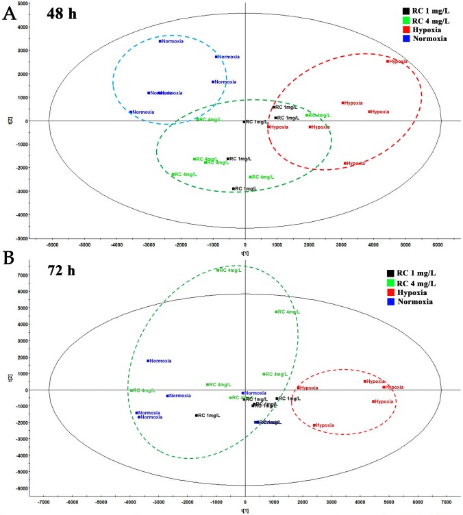
Figure 3.
The PCA plot among normal, hypoxia, and RC extract treatment groups. The red dash circle shows hypoxia control. Blue dash circle shows normoxia control. (A) The PCA score among normal, hypoxia and treatment after 48-h treatment. (B) The PCA score among three groups after 72-h treatment (n = 5).

