
Figure 7.
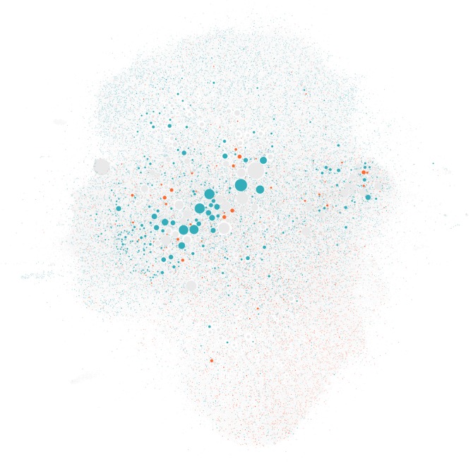
A network visualization representing the subset of 98,663 Twitter users who posted tweets including links to vaccine-related Web pages at least twice and were connected to at least one other user in the largest connected component. Users who posted at least 2 high-credibility Web pages and no low-credibility Web pages (cyan) and those who posted at least two low-credibility Web pages and no high-credibility Web pages (orange) are highlighted. The size of the nodes is proportional to the number of followers each user has on Twitter, and nodes are positioned by a heuristic such that well-connected groups of users are more likely to be positioned close together in the network diagram.