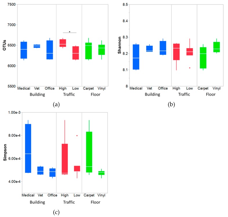
Figure 2.
Comparison of OTUs (a), Shannon diversity index (b), and Simpson diversity index (c) between the floor, traffic, and building types. The box-and-whisker plot indicates the median line, 1st and 3rd quartiles. The error bars below and above of a box indicate the 10th and 90th percentiles, respectively. Outliers are shown as filled circles. * Significant difference of OTUs between the high and low traffic areas was observed (p < 0.05).

