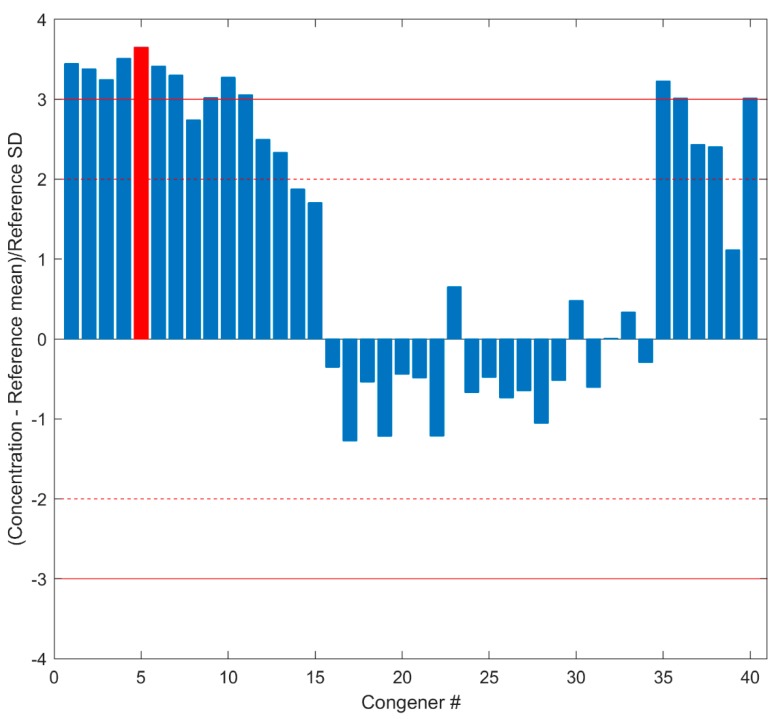
Figure 5.
Concentrations of congeners in Spike Data. The differences in concentrations of the 40 congeners between Spike Data and corresponding mean concentrations in Spike Reference are transformed by standardization scaling to the standard deviations calculated from Spike Reference and are plotted at the y axis. The x axis indicates the congener numbers that are given in Supplementary Table S1. The dashed lines give the region within two standard deviations, and the solid lines depict the region within three standard deviations. The red bar represents the scaled concentration of congener 1234789-HpCDF.

