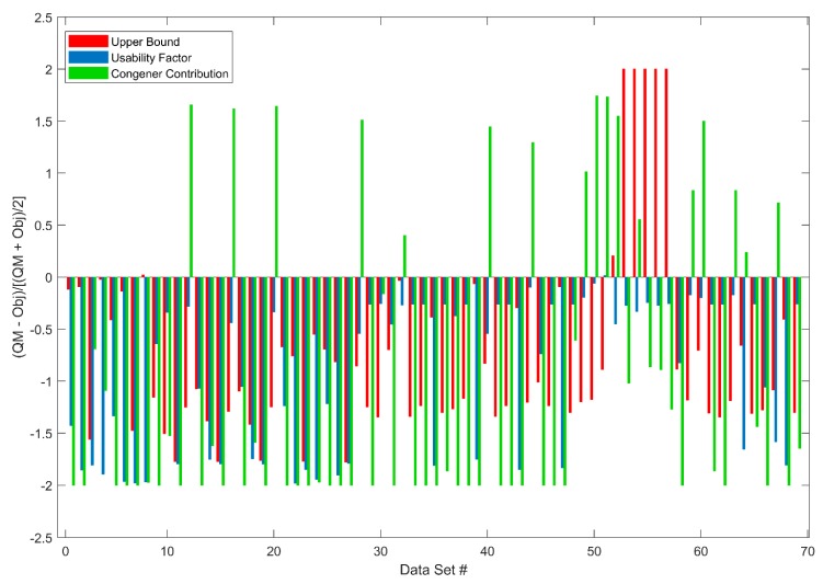
Figure 6.
Difference between quality metrics and their objectives for upper bound (red bars), usability factor (blue bars), and congener contribution (green bars) are shown on the y axis for the 69 Target Data sets. The x axis gives the order of the 69 Target Data sets. For the same dataset, if all three bars are above zero, the dataset is not usable; otherwise, it is assessed as usable. #: Data Set.

