
Fig. 2.
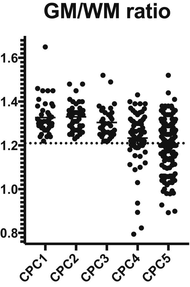
Scatterplot showing the distribution of GM/WM ratio according to the Cerebral Outcome Categories (CPC). Closed circles correspond to individual patient data.
Official websites use .gov
A
.gov website belongs to an official
government organization in the United States.
Secure .gov websites use HTTPS
A lock (
) or https:// means you've safely
connected to the .gov website. Share sensitive
information only on official, secure websites.
Scatterplot showing the distribution of GM/WM ratio according to the Cerebral Outcome Categories (CPC). Closed circles correspond to individual patient data.