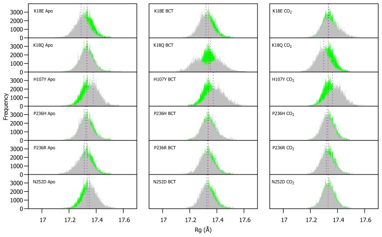
Figure 4.
Rg distribution of the WT and variant proteins over the 200 ns MD simulation. The green and grey histograms indicate the Rg distribution of the WT and variant protein, respectively. The red and blue dashed lines represent the mean Rg of the WT and variant proteins, respectively. Variant apo, BCT and CO proteins are each plotted against the WT apo, BCT and CO bound proteins, respectively. The x-axis represents Rg of sampled conformations during MD simulation, whereas the y-axis (Frequency) represents number of times a specific conformation was sampled.

