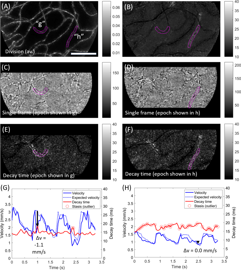
Fig. 3.
Examples of a shorter cell aggregate and of a vessel with consistently low haematocrit. Data acquired over 3.3 sec at 300 fps with 750 nm light, ∼2° from the foveal centre in a healthy subject. A) Motion contrast (division image) for this sequence, with two vessels of interest labelled (“g”, “h”) and highlighted in magenta. B) Average decay time metric for this sequence. Vessel h shows elevated decay time on average, whilst vessel g does not. C) Single processed frame from an example epoch (at t≈1.0s). Within the vessel of interest (magenta), a cell aggregate is seen exiting the left (venous) side of the segment. D) Single processed frame from another example epoch (at t≈2.5s). Within the vessel of interest (magenta), a long section of plasma is broken up by a single red blood cell, i.e. the local haematocrit is low. The flow characteristics for each example are best appreciated in Visualization 4 (5.9MB, avi) and Visualization 5 (6.2MB, avi) for segments g and h, respectively. E) Decay time image for the epoch corresponding to C. F) Decay time image for the epoch corresponding to D. G) Evolution of flow velocity (blue) and decay time (red) for vessel “g”. Expected velocity based on the field average is indicated (dashed blue). Black arrow corresponds to the epoch in C and E, and shows a pronounced drop in velocity. Outliers in decay time are indicated (circles). H) As for G, but data corresponds to segment “h”. The decay time metric varied inversely to the flow velocity. There are many outliers because decay time in this vessel is consistently elevated. Scale bar is 100 µm.

