
Figure 3.
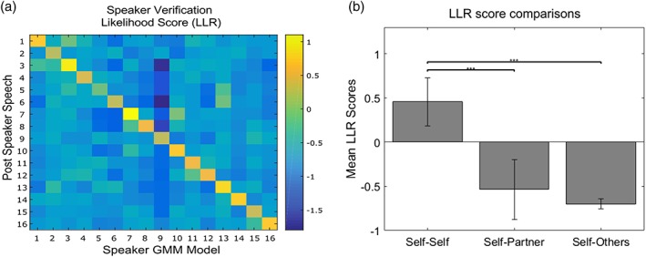
(a) Speaker verification confusion matrix of all the speaker‐dependent models against background UBM in the Solo_Post. Here the diagonal positive score line indicates a good MAP adaptation. (b) The bar plot represents the same data in plot a, only by grouping the data within participant, within dyads, and across dyads. This plot shows the obvious better fit of the model when it is tested on the same speaker (self‐self) and far lower performance when testing on another one [Color figure can be viewed at http://www.wileyonlinelibrary.com]