
Figure 3.
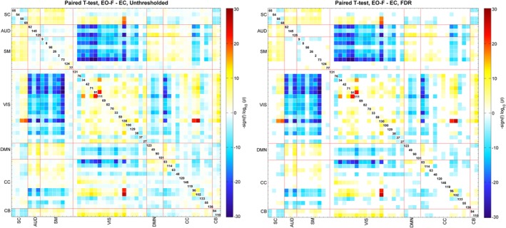
Paired t‐test results for EO‐F and EC FNCs, displayed as −sign(t‐statistics)*log10(p‐value) and on the right 0.01 levels FDR survivors. Blue color shows the regions that have higher correlation in EO‐F case and red color shows the regions that have higher correlation in EC case [Color figure can be viewed at http://wileyonlinelibrary.com]