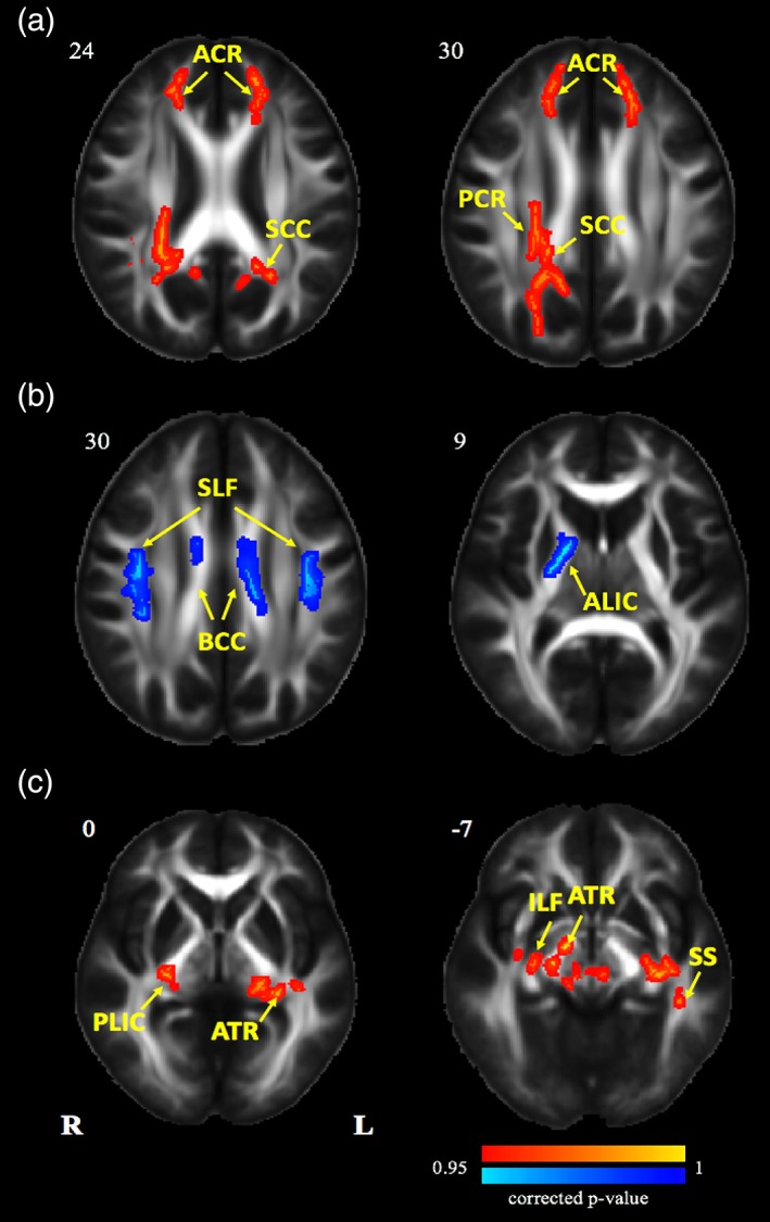
Figure 3.

Tract‐based spatial statistics maps are shown the FA differences in experimental and control groups. (a) Red represents regions with significantly increased FA after 2 years' HA exposure; (b) blue represents regions with significantly decreased FA after 2 years' HA exposure; (c) red represents regions with significantly increased FA after nearly 2 years' university life (p < .05, threshold free cluster enhancement (TFCE) corrected). HA, high altitude; FA, fractional anisotropy [Color figure can be viewed at http://wileyonlinelibrary.com]
