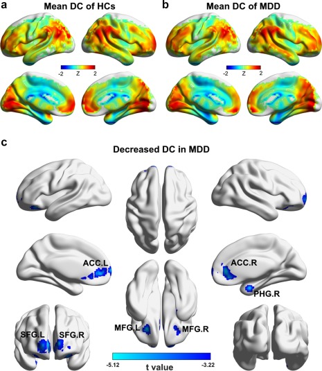
Figure 1.

Between‐group differences in DC maps at baseline. (a) Group‐average DC map of the HCs. (b) Group‐average DC map of the patients. (c) Regions showing decreased DC in the patients compared with the HCs [Color figure can be viewed at http://wileyonlinelibrary.com]
