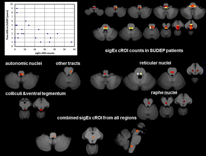
Figure 4.

The top shows a scatter plot of the sigEx cROI counts and time between last MRI and SUDEP (please see text for correlations) and the distribution of sigEx cROIs in the patients of the SUDEP group the color indicates the number of patients who had sigEx cROIs in this particular location with bright yellow indicating the highest number (n = 12) and dark red the lowest number (n = 1). The middle and the lower panels show sigEx cROIs sharing the largest amount of the variation with time to SUDEP in the SUDEP population for each of the six regions with significant correlations separately and for the sigEx cROIs from all regions combined. Please refer to the text for r and p values [Color figure can be viewed at http://wileyonlinelibrary.com]
