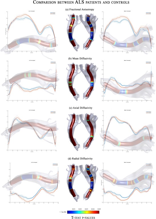
Figure 3.

DTI‐related profiles of the CST in ALS patients compared to controls. Plots of mean values are reported voxel by voxels for each group (patients in blue and controls in orange). Dotted lines ±1 SD represent the left and right CST. The x‐axis represents the voxel location (from 1 to 100) and the y‐axis reports the subjects’ group mean values of (a) Fractional Anisotropy, (b) Mean Diffusivity, (c) Axial Diffusivity and (d) Radial Diffusivity. T‐test statistics are plotted using a 3D rendering derived from the AFQ software. The results were thresholded by a conventional criterion for correction for multiple comparisons, which implied an appropriate threshold of significance at p‐level P < 3e‐04. The 3D representation (glass effect) of the tract is added to the plot background so that each location reported on the x‐axis corresponds to the same location in the 3D view. In the middle part of the figure, the same 3D representation is reported for the left and right tract where the P‐values are associated to colors of a heat map (statistically significant differences are displayed in blue). Abbreviations: L, left; R, right; CST, corticospinal; FA, fractional anisotropy; MD, mean diffusivity; AD, axial diffusivity; RD, radial diffusivity.
