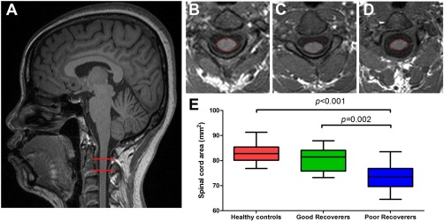
Figure 1.

Cross‐sectional spinal cord area differences among three groups of participants. (A) T1‐weighted image showing the region of cross‐sectional cord area measurement (within red horizontal bars). Spinal cord area in a healthy control (B), good recoverer (C), and poor recoverer (D). (E) Box plots showing the atrophy of cord area in poor recoverers relative to both healthy controls and good recoverers. [Color figure can be viewed in the online issue, which is available at http://wileyonlinelibrary.com.]
