
Figure 3.
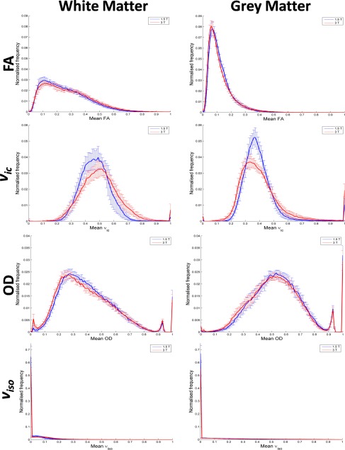
Mean normalised frequency histograms for FA and NODDI parameters in white and grey matter (left and right column, respectively). Histograms plot the mean across all eight subjects. 1.5 and 3 T data are in blue and red, respectively. Error bars represent standard deviations. [Color figure can be viewed at http://wileyonlinelibrary.com]