
Figure 4.
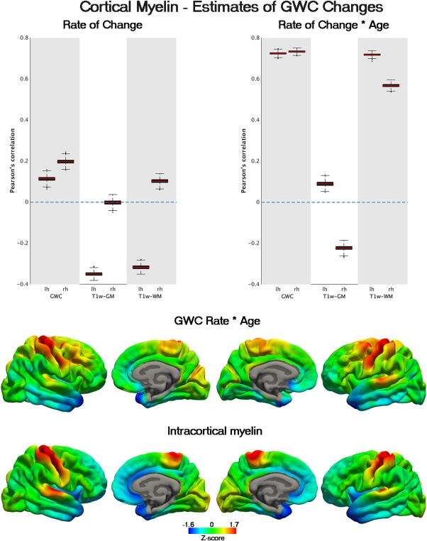
Anatomical relationship between cortical myelin and accelerated GWC decline. In the upper part, boxplots representing the correlation between T1w/T2w myelin content maps sampled at mid‐thickness (fraction = 0.5) and rate and rate*age estimates for GWC and T1w signal intensities. The red line represents the correlation between myelin and GWC and signal change estimates assessed as the median of n = 5000 correlations carried out with randomly selected subsamples of vertices. The black boxes represent the 25th and 75th percentile from all the random subsample correlations while whiskers denote correlations (with subsamples of vertices) with values deviating > 2 SD from the median (of the n = 5000 tests). In the lower side, z‐normalized estimates of GWC and myelin content maps are displayed in a colour palette. Red represents more cortical myelin and deceleration of GWC decline with age while Lightblue represents lightly myelinated areas and accelerated decline with age respectively. See Table II for significant stats.