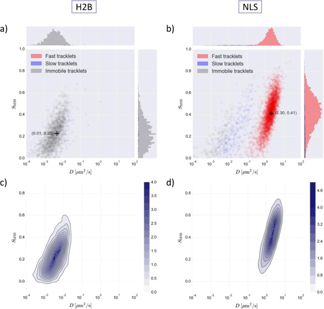
Figure 3.
SMSS versus D plots for the H2B protein and NLS. HaloTag was used for tracking. (a,b) scatterplot for H2B and NLS where red, blue and grey color coding corresponds to fast, slow and immobile tracklets, respectively. Histograms on the sides show the distribution of tracklets in the clusters relative to each other for the different axes. Cluster means are indicated by the + symbol. (c,d) kernel density estimation plot for H2B and NLS, color intensity indicates density (see colorbar).

