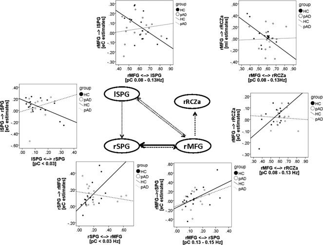
Figure 3.

Sketch of the four‐area network. Circles represent the structures, the arrows the modelled pair‐wise connection. The black solid arrows mark the connection in which functional connectivity predicted effective connectivity in pAD patients, dotted arrows indicate the connections, where functional connectivity did not predict effective connectivity in pAD patients. The scatter plots show group‐specific correlations for these connections. Dotted line marks the regression line in pAD patients, the solid line the regression line for HC subjects.
