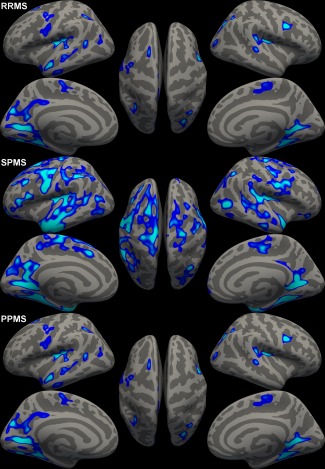
Figure 2.

Thickness difference maps highlighting significantly thinner regions in respectively the RRMS patients, SPMS patients, and PPMS patients compared to healthy controls. Figure displays vertexwise P‐values in significant clusters. [Color figure can be viewed in the online issue, which is available at http://wileyonlinelibrary.com.]
