
Figure 6.
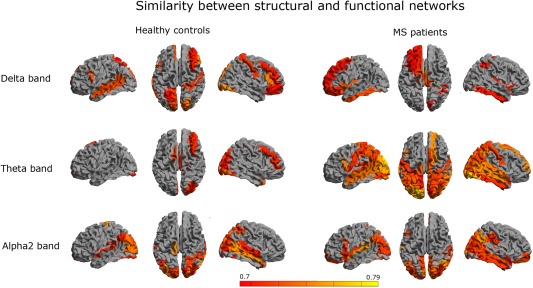
Regional similarity: To quantify the regional overlap between structural and functional networks, we computed a similarity measure as defined in Eq. (6) (see Methods). Color coded maps of the similarity for each region are shown for different frequency bands. Colors were attributed to a region only if the similarity between modalities for that region was significant. Red indicates relatively low similarity and yellow indicates relatively high similarity. We observed that the similarity was especially high in temporo‐posterior regions in MS patients (in the theta and alpha2 band), as well as for healthy subjects in the alpha2. [Color figure can be viewed in the online issue, which is available at http://wileyonlinelibrary.com.]