
Figure 3.
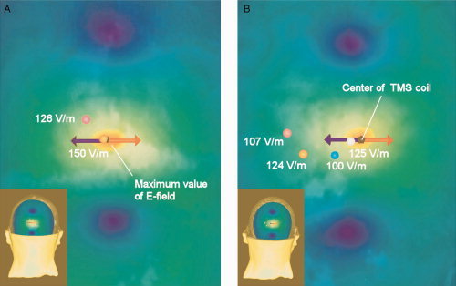
The distribution of the TMS‐induced E‐field at the visual suppression intensity (120% of the individual phosphene threshold) is illustrated for one participant (P7), when (A) the fMRI‐guided stimulation approach was applied and (B) when the external anatomical landmark approach was used. The colors orange‐yellow‐green‐blue indicate the strength of the E‐field in decreasing order. The red arrow illustrates the most effective current direction of the biphasic pulse and the blue arrow the less effective current direction. In (A) and (B), pink spot shows the approximate center of V2d Subarea 8 and orange spot represents the approximate center of V1 Subarea 8. The blue spot indicates the approximate center of V1 Subarea 6 and white spot the center of V2d Subarea 6. In (B), the E‐field strength is relatively high in V1 Subarea 8 even though the subarea seems to be located far from the E‐field hotspot. However, for this participant V1 Subarea 8 is located close to the skull surface, which explains the high E‐field. [Color figure can be viewed in the online issue, which is available at wileyonlinelibrary.com.]