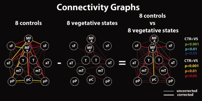
Figure 4.

Connectivity graphs for the eight healthy controls and the eight VS patients' groups and between‐group differences. Red (blue), orange (cyan), and yellow (green) lines represent P = 0.05, P = 0.01, and P = 0.001, respectively, for positive and negative differences. Thicker lines are connections surviving correction for multiple comparisons. Nodes are defined as for Figure 1. [Color figure can be viewed in the online issue, which is available at wileyonlinelibrary.com.]
