
Figure 4.
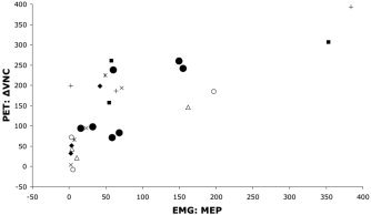
Scatterplot of hemodynamic and electrophysiological responses. The relation between PET blood‐flow responses at the stimulated site (M1hand) and MEP is illustrated for the seven PET responders. Filled circles are mean responses for each subject, pooling across conditions to illustrate the between‐subjects correlation of PET (ΔVNC) and EMG (MEP). Other symbols indicate individual subjects, illustrating the within‐subject effect of TMS intensity on both hemodynamics and electrophysiology. PET responses were quantified as the change in value normalized counts (ΔVNC) from the unstimulated baseline state. MEP was quantified as peak‐to‐peak amplitude in μV.