
Figure 2.
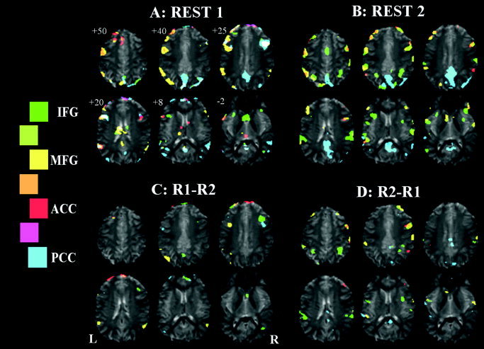
Seeded functional connectivity maps of Subject A, showing regions correlated with ACC, PCC, left IFG, and left MFG ROI average signal time‐courses shown in red, blue, green, and yellow, respectively. A: Initial rest period. B: Rest period immediately after an OLR vs. baseline paradigm. C: Comparison of the two rest periods, REST1 > REST2. D: REST2 > REST1. Legend shows the colour scale, with intermediate colours (between two regions) representing the overlap of those two maps.