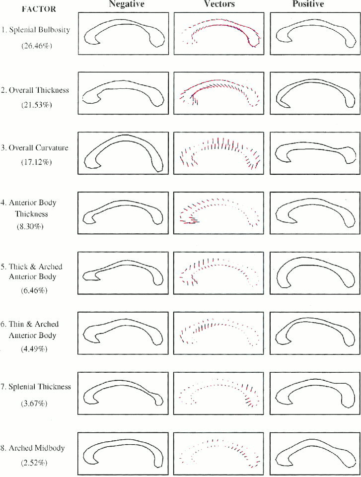
Figure 2.

Normal subject factor structure. From top to bottom are the eight factors presented in order of percentage variance explained. The assignments of shape characteristics to each of the factors are noted to the left of the respective contour. In parentheses are numbers indicating the percent variance of CC shape that is explained by each factor. References to the factors in the text denote the ordered rank of the factors. In the middle column of figures are the mean CC contours and the vector plots that represent the effects of systematic changes in factor loadings as small colored lines extending from the mean contour. The blue portions of the lines represent additions and the red portions represent subtractions from the mean contour. The left and right columns then depict the effects of those vector additions to the mean contour. We simply add to the mean CC contour multiples of the desired eigenvector to depict the effect of a given mode in the normal subjects. Here we let the multiplier range between ‐3 and +3 × the square root of the respective eigenvalue to portray the reasonable range of values that an individual contour is likely to take. These plots indicate the directionality of effects in correlation analyses, in that more positive factor scores will produce effects on the CC contour that are like those in the right‐hand column, and more negative scores will approximate effects represented in the left‐hand column.
