
Figure 3.
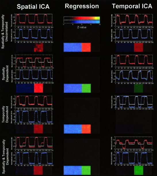
Results of analyses of simulated data. Thresholded activation maps are overlaid on a gray square using colors as follows: red corresponding to areas that produced the red time course, blue for areas that produced the blue time course, and green indicating areas that matched both time courses. Figures are arranged in a 3‐by‐4 grid where columns are SICA, regression, and TICA results, respectively, and rows are successive experiments. Note that SICA was “successful” in extracting the true answer in experiments (a) and (c), whereas TICA was “successful” in extracting the true answer in experiments (a) and (b). Regression was successful in all cases (to be expected since the exact model is known).