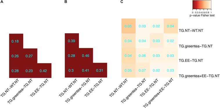
FIGURE 4.
Overlap of the differentially abundant and differentially phosphorylated proteins in transgenic mice after different treatments. (A) Heatmap showing the overlap between differentially abundant proteins across the different treatments in transgenic mice. The color code goes from very low p-values (red) to high p-values (yellow) of the exact Fisher test. TG, TG mice. WT, wild type mice. NT, not treated. EE, environmental enrichment. The Szymkiewicz–Simpson overlap coefficient is printed in cyan. (B) Overlap between differentially abundant phosphopeptides across the different treatments. (C) Overlap between differentially abundant proteins and proteins with differentially abundant phosphopeptides.

