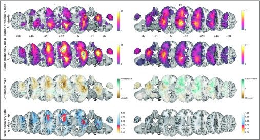
Fig 1.
Tumor probability map (TPM) comparison of all 98 versus 174 patients per team to evaluate referral bias for the left (L; 38 v 95) and right (R) hemispheres (60 v 79). Plotted from top to bottom are the TPMs from Amsterdam, TPMs from Utrecht, difference maps, and false discovery rate q value maps. The color codes correspond with the adjacent legends. From left to right, the axial sections of the Montreal Neurological Institute (MNI) brain template are shown of the plotted z coordinates. The Data Supplement provides results over all axial sections, including the unadjusted P value map.

