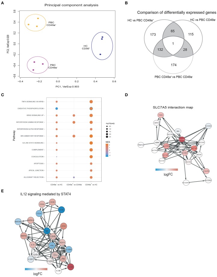
Figure 2.
(A) Principal Component Analysis of gene expression profiles segregates samples in three clusters for each condition. Each dot represents the gene expression profile of a sample. The colors indicate the different patient groups: HC (blue), PBC CD49a+ (orange), and PBC CD49a- (purple). The axis labels indicate the percentages of explained variance corresponding to the represented principal component. (B) Comparison of differentially expressed genes (DEG) between HC and PBC CD49a+ (group comparison), HC and PBC CD49a- (group comparison), and PBC CD49a+ vs. CD49a- (paired test). DEG were found using EdgeR with a false discovery rate (FDR) less than 0.05. (C) Gene-set enrichment analysis (GSEA) was performed against the hallmark set (Broad institute) using each one of the three group comparisons. (D) SLC7A5 interactions maps, with the red color representing the logFC in the CD49a+ vs. HC comparison for the SLC7A5 interaction. The network was created using String: p < 0.05. (E) Activation of the IL-12/STAT4 pathway in PBC CD49a+ cells in comparison with HC, color represents the logFC of each gene in the comparison (red indicates upregulation, and blue downregulation). The signaling pathway was created from ReactomeDB: p = 0.01.

