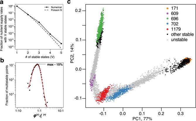
Figure 3. Patterns of multistability.
(a) The distribution of the number, , of multistable states across the entire space of nutrient supply rates. The data is based on Monte Carlo sampling of 1 million different environments (combinations of nutrient supply rates) in the 6C × 6N × 36S model. Solid circles show the fraction of all sampled environments for which uninvadable dynamically stable states are simultaneously feasible. The dashed line is the fit to the data with a Poisson distribution for extra states giving rise to multistability. (b) Fraction of multistable cases for different ratios of supply of two essential nutrients. The peak of the distribution is close to the balanced supply (). (c) The PCA plot of relative microbial abundances in the vicinity of the environment, where stable states coexist. Supply rates were randomly sampled within ±10% from the initial environment. Each point shows the first (x-axis) and the second (y-axis) principal components of microbial abundances in every uninvadable state feasible for this combination of supply rates. Colored circles label the original five stable states, black circles - several other stable states, which became feasible for nearby supply rates, and grey crosses - dynamically unstable states feasible in this region of nutrient supply rates.


