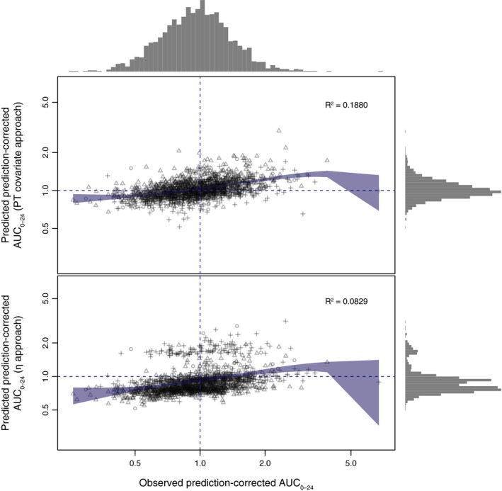
Figure 3.

Comparison of the PT covariate and η approaches for predicted vs. observed prediction‐corrected AUC 0–24. Blue shaded area indicates the 95% confidence interval of the locally estimated scatterplot smoothing regression fit. The gray histograms on top and on the right indicate the frequency distribution of the observed and predicted AUC 0–24. Different symbols indicate different indications (atrial fibrillation = circles, venous thromboembolism prevention = triangles, venous thromboembolism treatment = crosses). AUC 0–24, area under the plasma concentration–time curve from 0 to 24 hours; PT, prothrombin time.
