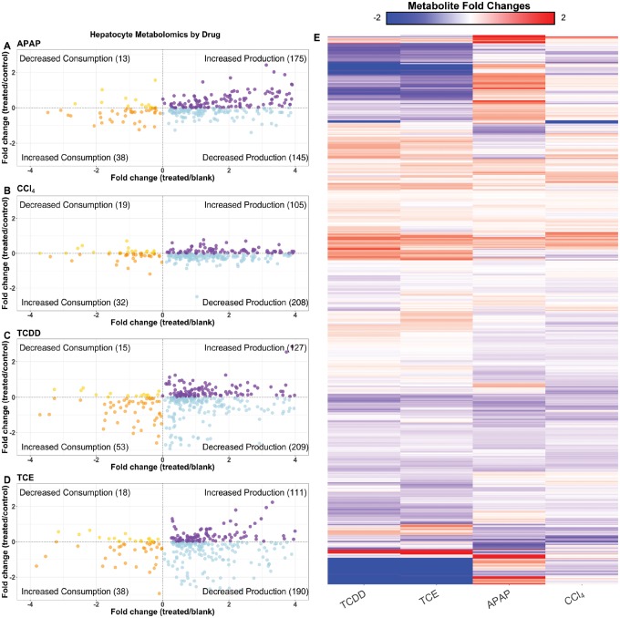
Figure 3.
Overview of the metabolomics data. The scatter plots show the distribution of metabolites that are significantly (p<.05) changed when compared with either the control media or blank media, and colored according to their levels when compared with both sets of media. Metabolites in the top left corner have decreased overall consumption, metabolites in the bottom left corner have increased overall consumption, the bottom right corner indicates decreased overall production, whereas the top right corner shows increased overall production, all with respect to the control media. Plots are shown for APAP- (A), CCl4- (B), TCDD- (C), and TCE- (D) induced toxicity conditions at six hours. The heat map above shows the log2 fold changes for metabolites compared with their respective controls (E). Each condition is listed on the x-axis, and the metabolites are listed on the y-axis. Metabolites on the x-axis are clustered by Euclidean distance, using complete linkage.

