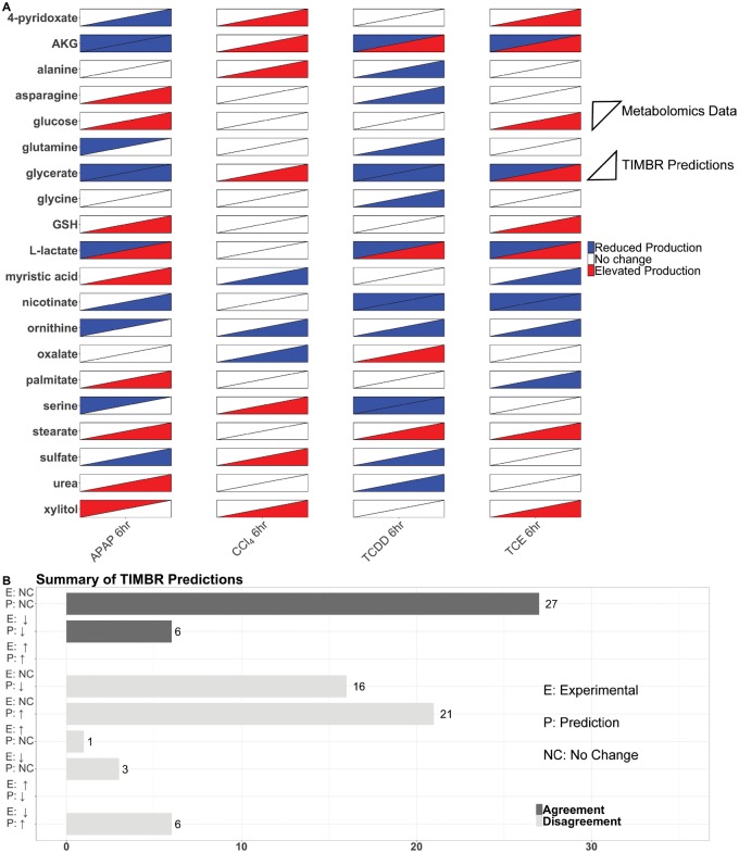
Figure 5.
Validation of TIMBR production scores using metabolomics data. The heat map (A) shows the results from the metabolomics data, and the TIMBR production scores for each metabolite we were able to make a prediction for and validate. Each condition is listed on the x-axis, and the metabolites are listed on the y-axis. Metabolomics data are shown in the upper left triangle, and TIMBR production scores are shown in the bottom right triangle. The bar chart (B) shows the categories a prediction can fall into on the y-axis ranging from increase, decrease, or no change for both the experimental data and the TIMBR predictions. The x-axis contains the number of predictions that fall into the category on the y-axis. Predictions that agree with the experimental data have dark colored bars, whereas disagreement between the data show light colored bars.

