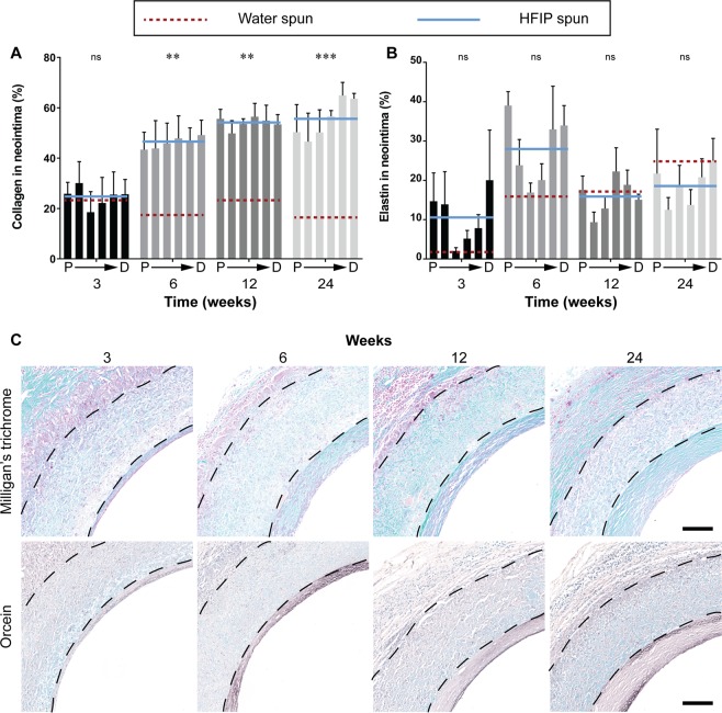
Figure 6.
Extracellular matrix deposition in the neointima. Data expressed as mean ± SEM, n = 4 animals/timepoint. The solid blue line represents the average of the bars presented (HFIP spun) and is compared to red dotted line which represents the average of water spun grafts (bars not shown). Statistical analysis comparing these averages was by two-way ANOVA, using Šídák multiple comparison test, with *p < 0.05, **p < 0.01, ***p < 0.001. P → D represents sections of the graft from proximal to distal. (A) Quantification of total collagen in the neointima represented as a percentage of the neointimal area. (B) Quantification of elastin in the neointima represented as a percentage of the neointimal area. (C) Representative images of cross sections at the proximal end of HS silk vascular grafts, black dotted lines indicate the graft wall. Top row: Milligan’s trichrome, collagen stained in green. Bottom row: Orcein, elastin stained in dark brown. Scale bar = 200 μm. Data for the WS group were modified from a previous study13.

