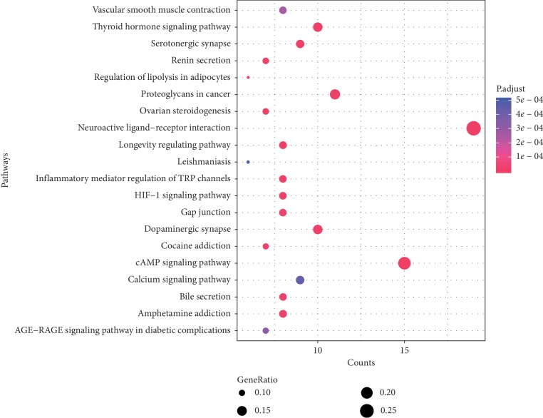
Figure 4.
The top 20 pathways. The longitudinal axis: the pathway name; the transverse axis: the number of enriched genes; the size of the dot represents the proportion of the number of enriched genes to the total number of genes, and the larger the proportion is, the larger the dot is; the redder the dot color, the more significant the P value.

