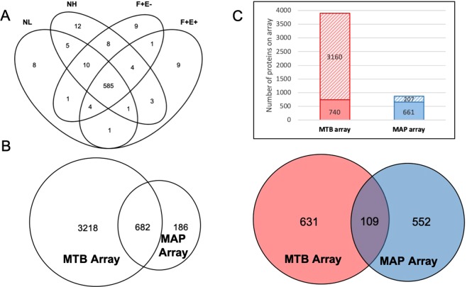
Figure 1.
Reactive MAP proteins identified in this study and comparison of MAP and MTB protein array results. (A) Venn diagram at 10% threshold shows MAP antigen hit number distribution of all 4 groups: negative low exposure (NL), negative high exposure (NH), fecal positive & ELISA negative (F + E−), and fecal positive & ELISA positive (F + E+). (B) Orthologs between MAP and MTB arrays. Left circle represents MTB array containing 3,900 MTB proteins and right circle represents MAP array containing 868 proteins. The overlap region indicates orthologs between the two arrays. (C) Comparison of reactive proteins between MAP and MTB protein arrays. Top: number of reactive and non-reactive proteins in MTB and MAP arrays. Solid squares represent reactive proteins and twill squares represent non-reactive proteins. Bottom: red circle represents MTB reactive proteins and blue circle represents MAP reactive proteins. Overlap region represents reactive proteins identified by both arrays.

