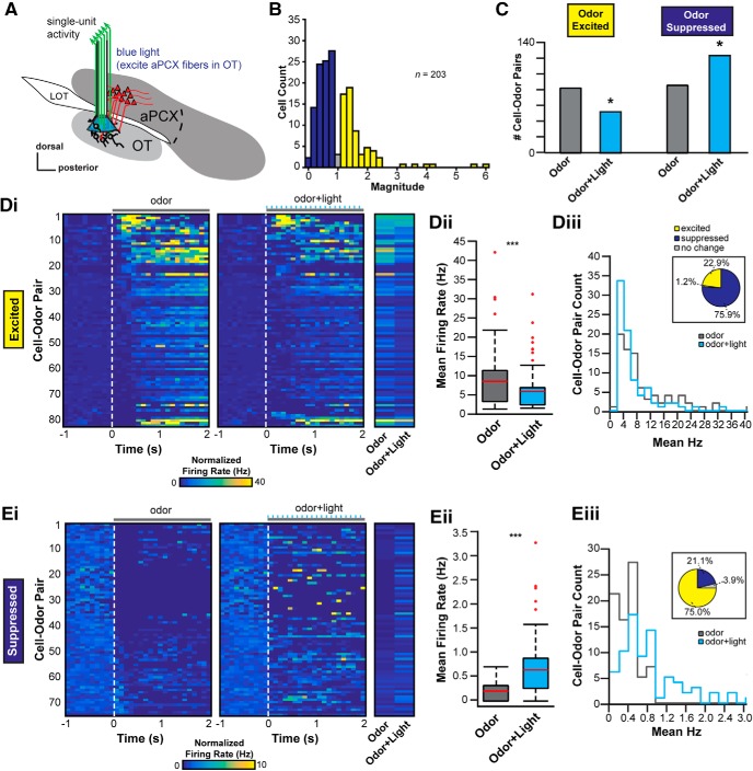
Figure 4.
The aPCX influences odor-evoked activity among OT neurons. A, Schematic depicting the location of the optetrode assembly in the OT to record OT extracellular activity and photostimulate aPCX association fiber terminals within the OT. B, Distribution of the average light-evoked response magnitude (ratio of spike numbers before, compared with during, stimulation; no odors presented) across the population of recorded units. Of 203 single units recorded, the majority displayed reduced firing in response to activation of aPCX association fibers (dark blue), while some displayed increases in firing (yellow) and a small number showed no change (gray). Colors imply direction of changes, not statistical significance. C, Population change of odor-responsive OT neurons during aPCX light stimulation. Data are organized based upon cell–odor pairs which were significantly odor excited or odor suppressed and further organized with or without aPCX light stimulation. *p < 0.05. D, E, Modulation of cell–odor pair response from odor alone to odor + light stimulation together. D, Cell–odor pairs significantly excited by odor. E, Cell–odor pairs significantly suppressed by odor. Panels i to iii use the same conventions for both D and E. Di and Ei, 2D histograms representing the change in firing rate from 1 s of background activity to 2 s of either odor presentation (left) or odor + light presentation (right). Each row is one unique cell–odor pair and is the same for both left and right 2D histograms. Each column is a 100 ms average firing rate bin for that cell–odor pair. End 2D histogram shows the average evoked response (either odor or odor + light) for each cell–odor pair. Dii and Eii, Boxplot displaying the change in average firing rate across the population for odor alone (gray box) versus odor + light together (blue box). Both plots are significant using a paired t test comparing odor versus odor + light. ***p < 0.001. Red line designates the mean, the box designates the 50th percentile range, and the whiskers designate the 25th and 75th percentiles. Red dots are outliers. Diii and Eiii, Distribution of change from odor alone (gray line) to odor + light together (blue line) from mean firing rate evoked in each case. Pie chart above shows the percentage change from odor alone. Significant changes determined by paired t tests, with those at p > 0.05 defined as “no change.”

