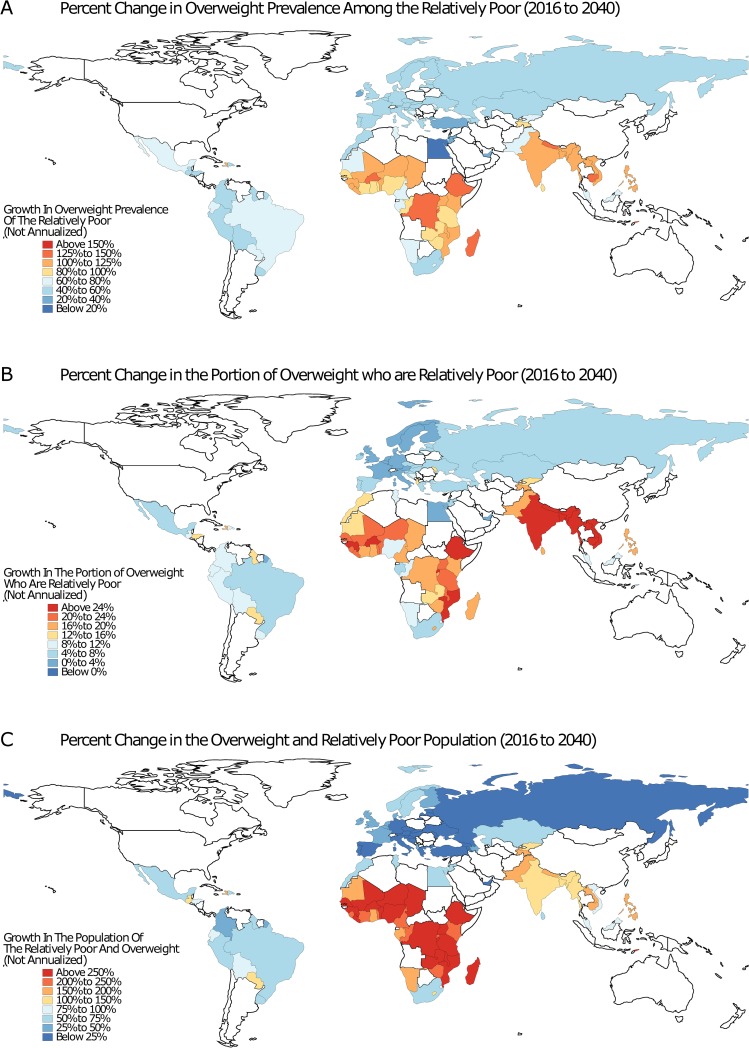
Fig 4. Overweight inequality projections, 2016 to 2040.
Each map displays country-level projections in overweight prevalence inequality. Map A shows the percent change in overweight prevalence among the relatively poor, defined as individuals in the bottom quintile of the personal wealth distribution. Map B displays the percent change in the share of overweight individuals who are relatively poor. This differs from Map A by quantifying where the reversal of the wealth-overweight gradient will occur the fastest. Map C displays the percent change in the overweight and relatively poor population. The base map was obtained from Natural Earth (https://naturalearthdata.com).

