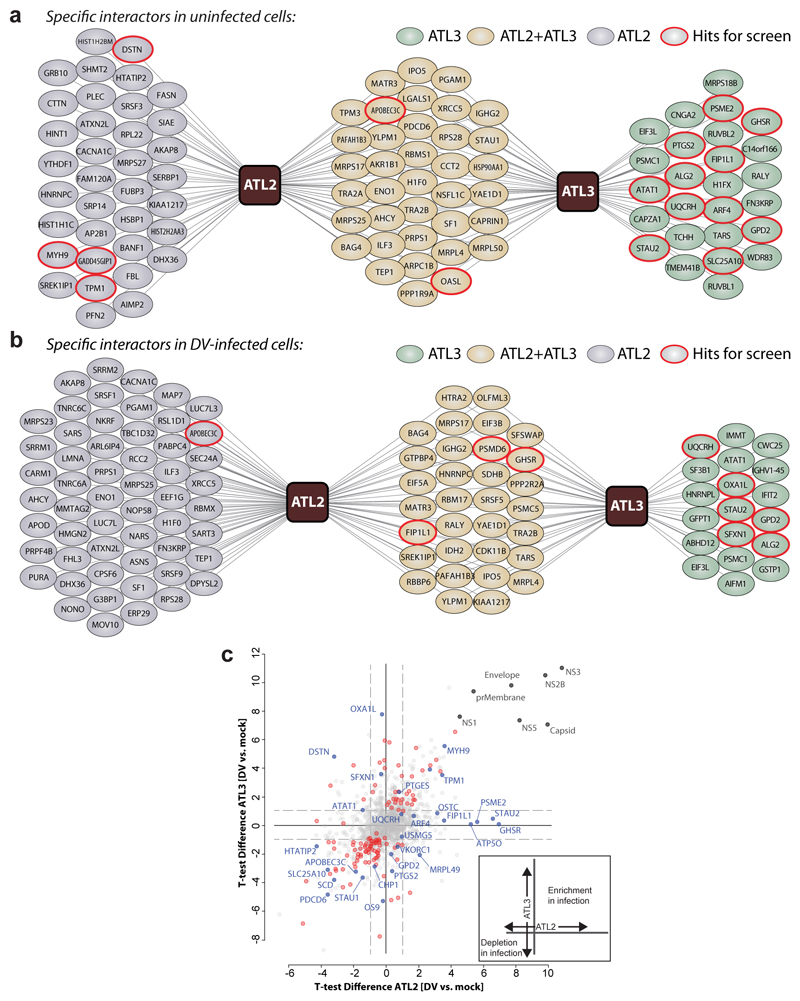
Figure 4. Comparative ATL interaction networks.
a-b, Network representation of unique and shared ATL2- and ATL3-interacting cellular proteins. AP–LC–MS/MS analysis of HA-tagged ATLs in comparison to Calnexin (CANX). N = 4 independent experiments; significance testing are results from Welch’s T-test. a, Solid lines represent specific interactors identified by AP–MS/MS analysis of naïve A549 cells (log2(fold change) ≥ 2.5, unadjusted two-sided p ≤ 0.05). b, Solid lines represent specific interactors identified by AP–MS/MS analysis of DV-infected A549 cells (log2(fold change) ≥ 1), unadjusted two-sided P ≤ 0.05). c, The scatter plot displays ATL2 (x-axis) and ATL3 (y-axis) specific changes in uninfected compared to DV infected cells. Virus proteins (grey), significant enrichment or depletion (red) and specific hits selected for RNAi screen (blue) are shown. Significantly enriched or depleted proteins are shown in red (n = 4 independent experiments; Welch’s T-test unadjusted two-sided p ≤ 0.05; log2(fold-change) ≥ 1). A schematic of the variables compared is shown on the bottom right.

